Introduction
Responsive web design has revolutionized the way we build websites, ensuring they adapt beautifully across various devices and screen sizes. And now, there's an exciting addition to this repertoire: CSS Container Queries. In this blog post, we'll dive into the world of CSS Container Queries, exploring how they work and how they can enhance your responsive design workflows. Let's get started!
What are CSS Container Queries?
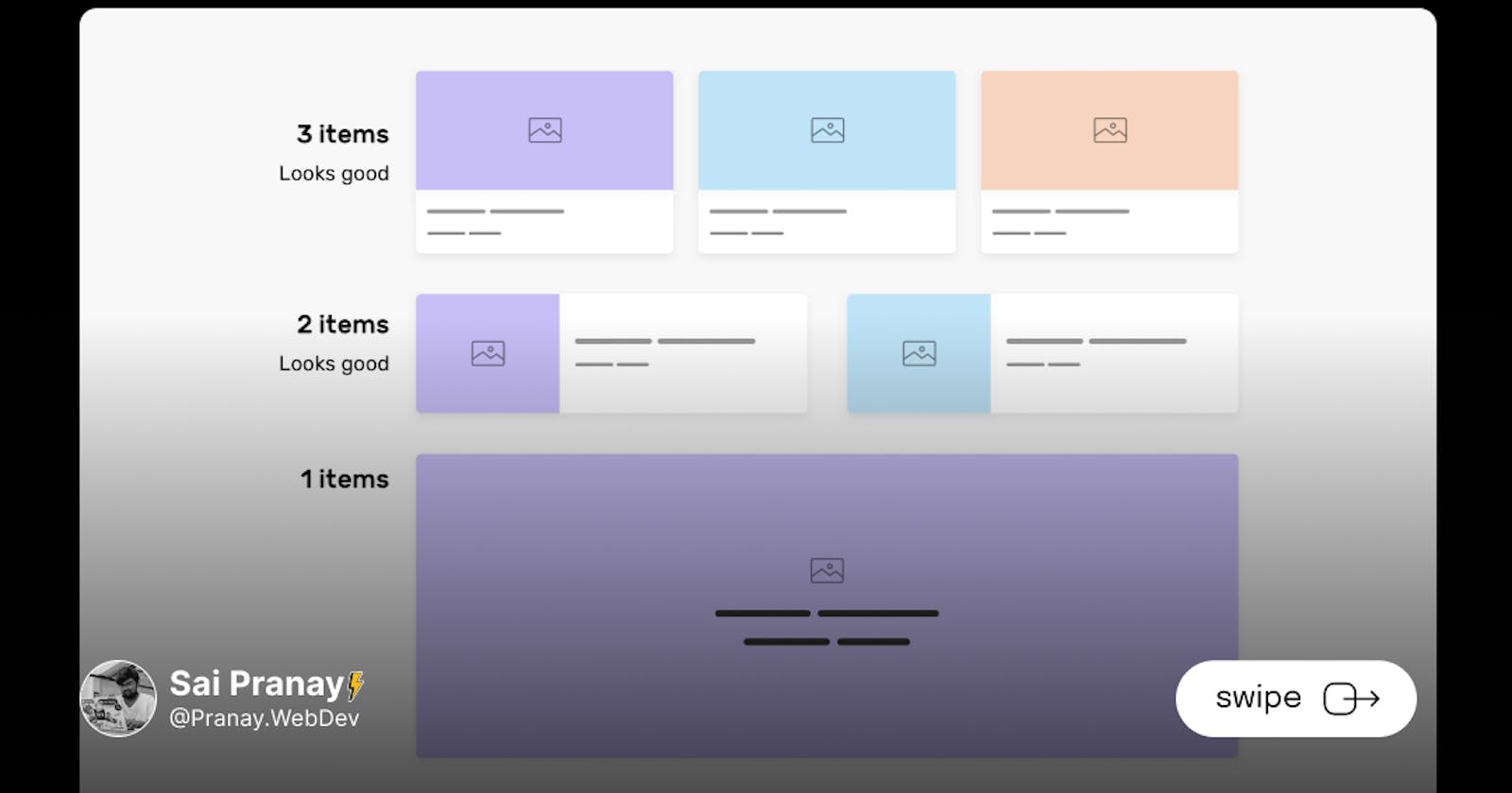
CSS Container Queries are a powerful new feature that allows you to apply styles to elements based on the size of their parent container, rather than just the viewport. This means you can create more granular and context-aware responsive designs. Instead of relying solely on the overall screen size, container queries enable you to adjust styles based on the specific container dimensions, providing greater flexibility and control.
Using Container Queries:
To utilize container queries, you start by declaring an element as a 'container' using the contain property. For example:
.container {
  contain: layout inline-size;
}
Once you've defined the container, you can then use the @container at-rule to apply styles based on its size. Here's an example:
@container (min-width: 500px) {
  .child-element {
    /* Styles to be applied when the container's width is at least 500px */
  }
}
In the above code, the .child-element will have the specified styles applied when the container's width is at least 500px. You can define multiple container queries to fine-tune your designs for different container sizes.
Key Differences:
CSS Container Queries vs. Media Queries: While media queries apply styles based on the viewport size, container queries focus on the container size. This key distinction allows for more context-aware styling, as the elements respond directly to their containing context. Container queries provide a level of responsiveness that is specific to the immediate parent container, offering a new level of control over your designs.
Browser Compatibility:
Excitingly, CSS Container Queries are now supported in many modern browsers, opening up a new era of responsive design possibilities. However, it's important to keep an eye on browser updates to ensure you're leveraging this feature effectively.
Conclusion:
CSS Container Queries are a game-changer for responsive web design, providing developers with increased flexibility and control over how their elements adapt to different container sizes. By incorporating container queries into your workflow, you can create designs that respond intelligently and intuitively to their surrounding context. So, why not explore the possibilities of CSS Container Queries and take your responsive design skills to new heights?
Remember, with CSS Container Queries, the responsiveness of your designs is no longer limited to the viewport alone; it extends to the very containers that hold your content. Embrace this new feature and unleash the full potential of responsive web design!
Happy coding!
